The dull season is behind us and spring is already in full swing. Time to bring colour back into everyday life. Exciting hues and playful designs are particularly in vogue in spring 2023. But muted earth tones and calming colours also continue to enjoy great popularity. Give your assortment a new coat of paint with our colourful promotional items.
Pastel shades
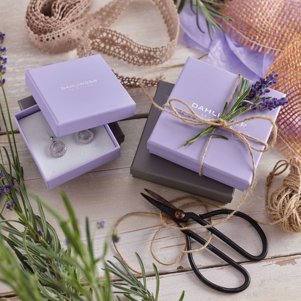
This year, too, pastel shades play a major role in the packaging sector. They radiate calm and serenity and, thanks to their restrained appearance, ensure that jewellery items are optimally staged. Young target groups in particular are attracted by these colours. Our CANDY 118 is now also available in the colour lavender to match.
Berry tones
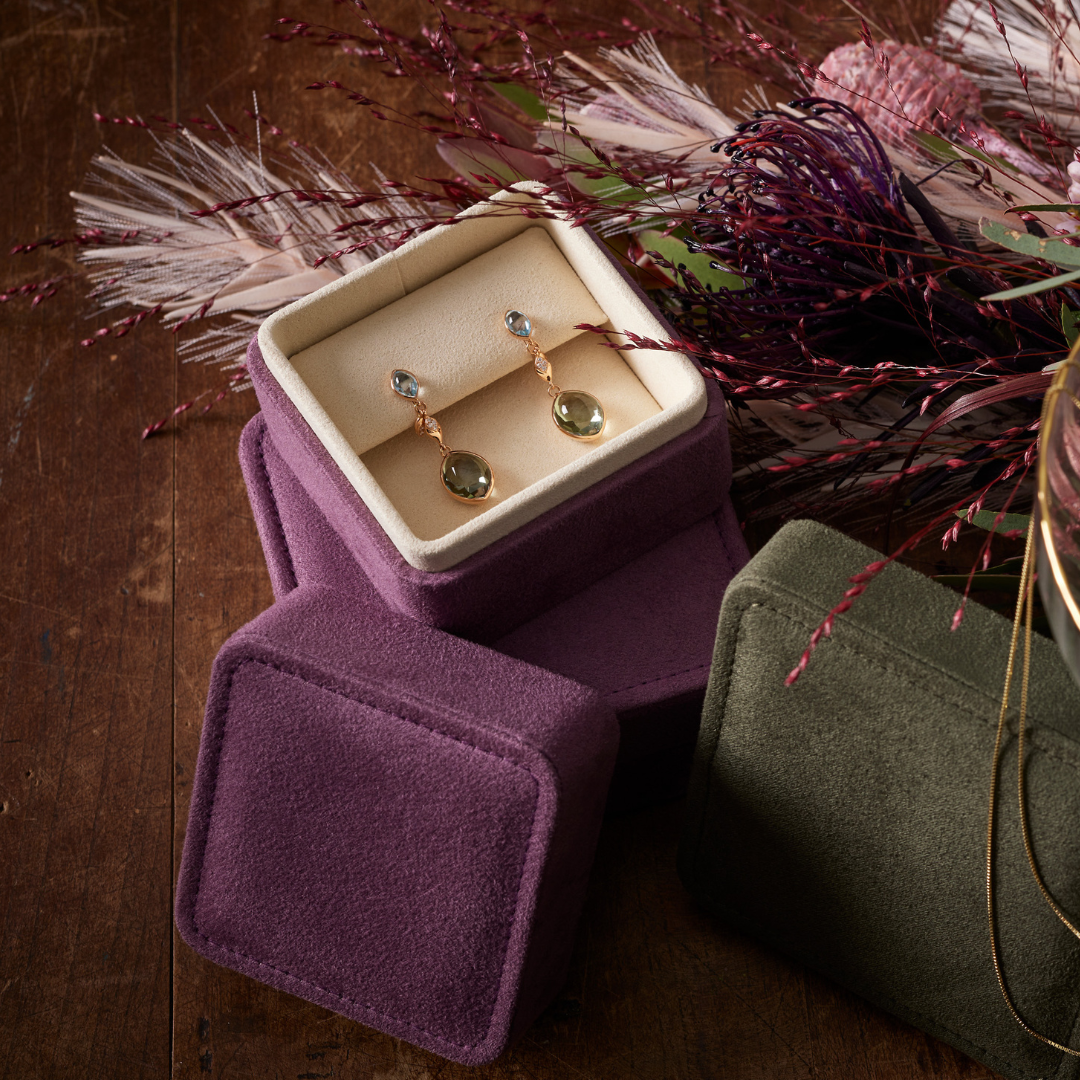
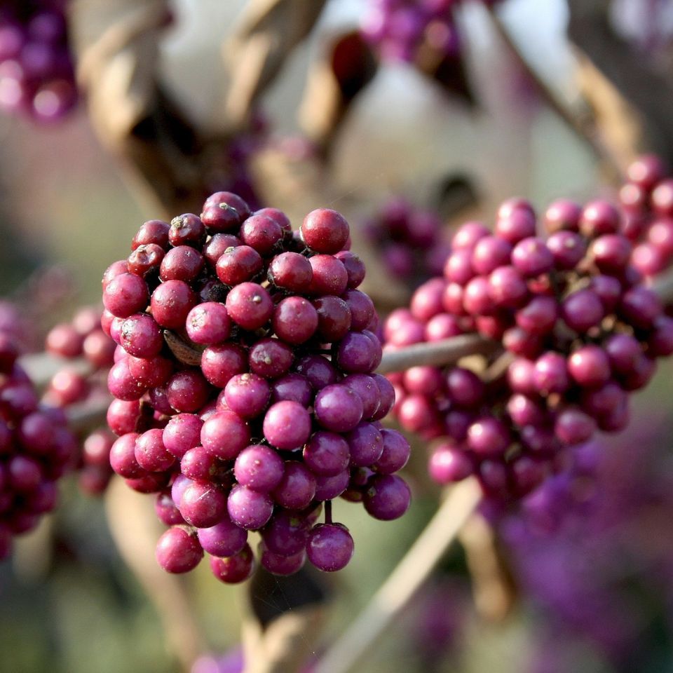
Strong berry tones look luxurious and bring colour into play. They radiate strength and self-confidence without being too obtrusive. The jewellery is still in the foreground and benefits from the vibrancy of the jewellery packaging. A good example is our CAMELLIA 380, which harmonises beautifully with silver, warm tones as well as contrasting shades of green.
Earth tones
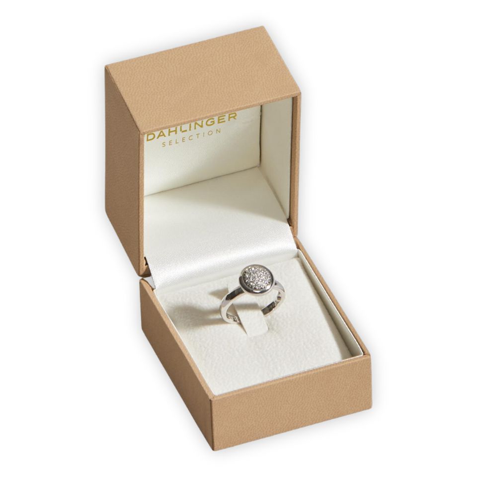
Earth tones are still in demand. They radiate down-to-earthness and closeness to nature. From sandy tones to light browns and dark browns, everything is possible. With this colour, the jewellery packaging deliberately recedes into the background and underlines the value of the jewellery. These shades harmonise with both gold and silver jewellery and are therefore real all-rounders. Try it out for yourself with our ECCO 442 in light brown or our VOGUE 443 in dark brown.
Gold and Silver
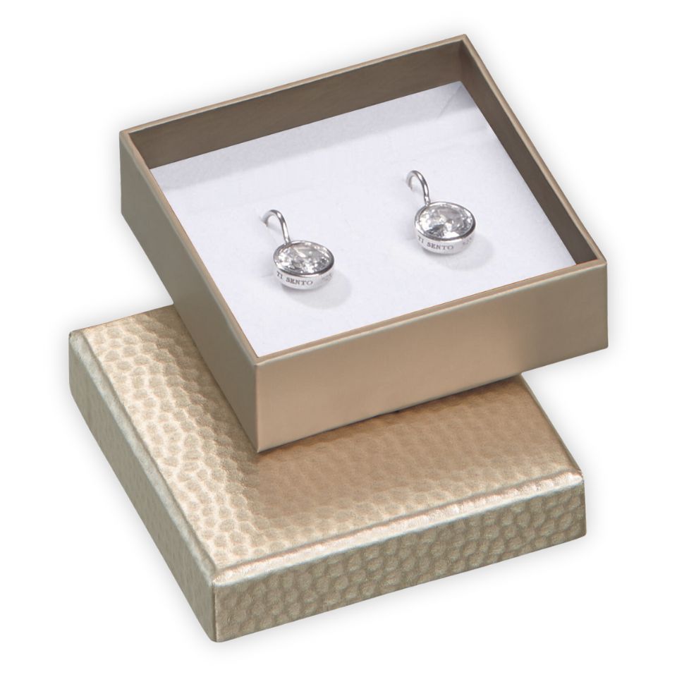
Gold and silver are still classics in the jewellery packaging sector and shine with their timeless appearance. They are suitable for filigree jewellery as well as for unusual jewellery creations. There are no limits to the imagination. Jewellery packaging with a hammered motif such as our SURPRISE 128 is particularly suitable for goldsmiths. It combines an elegant look with elements of craftsmanship.